Perils of DITA publishing, part 2: Graphics
In which we build assorted graphics and develop style guidelines.
Second in a series of posts describing how the team at Scriptorium used DITA as the foundational technology for our new book, Content Strategy 101.
When Content Strategy 101 was still in its draft stages, I worked with Sarah O’Keefe and Alan Pringle to create a consistent look and feel for the book’s graphics.
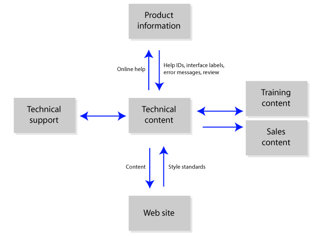
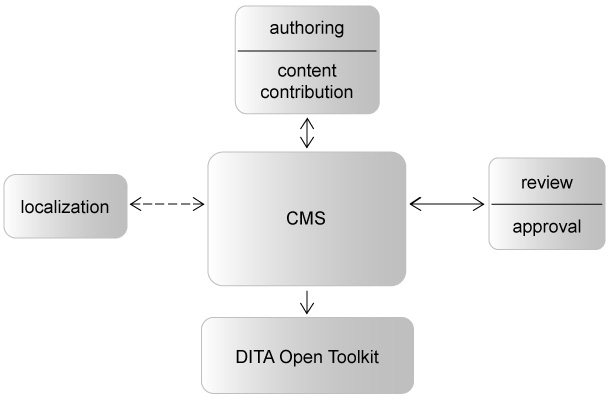
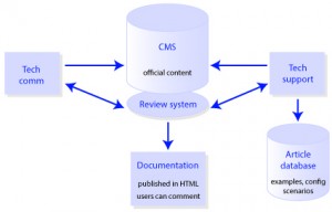
We started with a few preliminary flowcharts Sarah had created and some project workflow graphics we’d made for clients:
Looking at the fonts, colors, and styles of the boxes and arrows, we saw that our early graphics were highly inconsistent. Clearly, we needed style guidelines before we created any new ones.
We came up with our design standards, bearing in mind that the graphics needed to:
- Be DITA-friendly. Since I created the graphics as vector images in Adobe Illustrator, I saved them as SVG files.
- Render in color and grayscale. We chose a light and dark blue color scheme that displayed as high-contrast light gray and black when printed.
- Fit inside pre-defined page dimensions. I made an Illustrator artboard the maximum width and height that images were allowed to be, and used this as a template for building all new graphics.
- Be clean and consistent. We used shapes to represent certain components across all the workflow graphics—boxes for teams or content types, ovals for filters such as vetting or stylesheets, cylinders for databases, and arrows for flows of information.
After we’d chosen our styles, it was time to create the graphics. Working in DITA presented both conveniences and challenges.
Some of the more difficult aspects of the DITA workflow included:
- Preserving page space. With any DITA publication, it’s impossible to know how a topic will look in every output format—especially when the book is still being written and the content changes every day. Therefore, we used horizontal graphics whenever possible, since they wouldn’t take up as much page space or be as likely to cause awkward page breaks. We couldn’t always avoid vertical or square-shaped graphics, but we edited many of them to tighten up vertical space.
- Locating graphic files for editing. Because the book’s structure changed several times during the authoring process, I named the graphic files according to their subject matter instead of the order in which they’d be displayed. Once we started editing, however, we flagged graphics that needed corrections by figure number in the PDF file of our latest draft. In the future, I’ll name graphics by their parent topic names instead of their subject matter to make them easier to find.
- Maintaining consistency. As the book’s content was changing, I was creating new graphics and editing older ones at the same time. Even with style guidelines, working out of order and making numerous edits can allow some inconsistencies to slip by. I resolved this with a final edit of all the graphics once the book’s content was finished.
The DITA authoring process also provided some valuable benefits, such as:
- The audience attribute for images. Some of our graphics included screenshots, which rendered better in color than in grayscale. I made separate color and grayscale versions in Photoshop. Then I linked to both images, using audience=”book” to display the grayscale image for print and audience=”color” to display the original color version for EPUB.
- The ability to work with topics. When Sarah or Alan wrote new content that needed a graphic, they could point me to that topic—no sifting through long chapters to find the content changes.
Creating graphics in a DITA publication was both a challenge and a great learning experience. Planning ahead and choosing style guidelines early helped the process run more smoothly.
Keep watching our blog for our next post on the perils of DITA publishing, where Alan Pringle will talk about indexing.


Paul K. Sholar
Naming graphics files by parent topic name? Not very reuse-oriented. Try again!
Gretyl Kinsey
Good point. In this case, reuse of graphics wasn’t as much of a priority as saving time. During reviews, we looked at the book in PDF format, and feedback on the graphics was given as, “Make these changes to figure X on page Y.” I would look at the graphic in the PDF file, then try to remember what I’d named the source file so I could find and edit it. Having the graphics named by subject matter was only somewhat helpful—I usually had to open multiple source files that sounded like they might be the right one before I found it. What I need in the future is some kind of naming convention that lets me look at a graphic in the output and instantly know what the source file is called so I can avoid this kind of time sink during reviews. Any ideas?
Paul K. Sholar
Another reason to have naming conventions for graphics files is platform/OS file-system independence. You don’t want to be bitten by that after producing 100s of files.
Leigh White
I had the same thought as Paul S. before ever reading the replies. However, I put your processes in the context of your particular workflow for this particular publication, which is unlikely to involve a lot of reuse. You were pretty specific that the approaches you’re outlining in this series of blogs is *very* specific to this book and not a list of best practices in general. I go back to my comment on the first blog in the series, that I applaud your pragmatic approach to your particular project. If you know for sure that you’re not going do X, Y, and Z, then setting up your content as if you *were* going to do X, Y, and Z can complicate the project unnecessarily. Granted, sometimes you never know what might happen down the road…but often you do. And I can’t wait for the blasphemous index!
Gretyl Kinsey
Very true—adapting DITA for this publication meant taking some approaches that made sense for our book but wouldn’t work in other situations.