The power of complexity in visual communication
One of the axioms of technical communication is to keep things simple. But sometimes, complex communication is the better alternative.
(This post springs from a discussion that took place during tekom in a Wiesbaden hotel lobby. I distinctly remember Tony Self being involved, and maybe Kyle Wiens? I’m forgetting the others, probably due to jet-lag-induced short-term memory problems. Joe? Ray? Larry? Curly? Moe?)
Many types of information have their own vocabulary along with conventions for visual communication. Consider the following:
Most of you probably recognize this as music, but can you read the music and identify the piece? (Here’s a recording.)
If you read music well, you can derive a huge amount of information from this snippet: notes and rhythms, phrasing, dynamics (how loud or how soft), what instrument to use (this excerpt doesn’t explicitly call for a piano, but it’s implied by the way the music is organized), fingering notation, and more. In this example, knowledge of musical Italian is helpful to interpret “sempre pianissimo e senza sordini” (always very quiet and without mute) and other phrases.
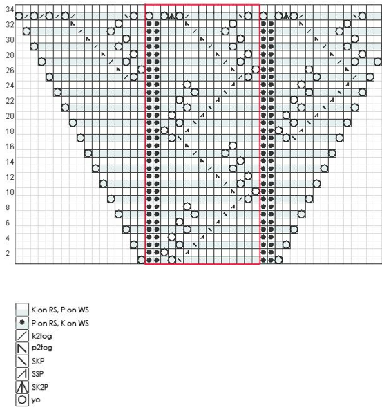
Here is a different example of specialized visual language (excerpt):
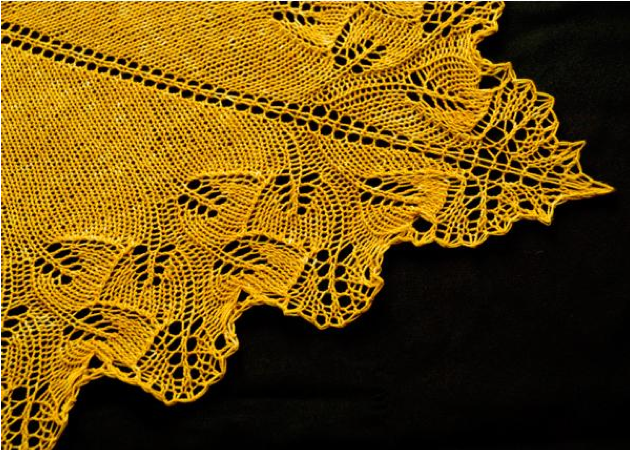
Here’s the result of the full chart:
Knitting charts, like music, use a standard set of symbols. But unfortunately for the worldwide knitting community, there are many regional variations. (The problem is even worse in crochet, where phrases like “double crochet” and “triple/treble crochet” have different meanings in British English patterns than in American English patterns.) That said, it is feasible for a knitter who only speaks English to use Russian or Japanese knitting charts.
Tony Self contributed this “Aresti diagram,” which I had never seen before.
Any idea what this represents? Our group was able to figure it out with some hints. (Note the wind direction indicator at the top right.) Here’s an explanation of Aresti diagrams.
Jargon and industry-specific terminology is appropriate for some audiences, and can actually reduce or eliminate the language barrier presented by text descriptions. But to an outsider, they are completely unhelpful. All of these visuals assume a certain level of knowledge in the subject matter. The knitting chart, for instance, says that an empty box means “K on RS, P on WS.” That is, “knit on right side, purl on wrong side,” which makes total sense to knitters and nobody else. Abbreviations like k2tog (in knitting), dc (crochet), or mf (music) are obvious to the insider and incomprehensible to the outsider.
Once again, with feeling:
Know your audience.
Sources:
Example 2 (free registration required)


Nicky Bleiel
Absolutely agree that the bottom line is “know your audience” … but I’d say that these charts are an example of simplicity, not complexity.
If you explained how to play a piece of music, or a crochet/knitting pattern, etc. using text, THAT would introduce unnecessary (and not-useful-at-all) complexity, because text isn’t the “language” of these arts/sciences.
“Knowing your audience” means that you deliver the information in the appropriate language, which by default involves simplicity.
Sarah O'Keefe
I suppose that I’m defining “complex” as “not accessible to the beginner.”
Larry Kunz
Yes, definitely: know your audience. And also, savor the possibilities for communicating a lot of technical information in a small space — like a tablet or even a smartphone screen.
My favorite example of a compact, highly audience-dependent (though not graphical) format is the baseball box score.
Sarah O'Keefe
Sports in general is a good example of communication that requires subject matter knowledge. The TV graphics overlaid on baseball, basketball, or football are chockfull of status information if you know what you are looking at.
Daniel D. Beck
I love seeing charts that are mystifying until somebody provides the key that turns it into a meaningful progression (I got two out of this post). One of my favorites is featured heavily in Edward Tufte’s book The Visual Display of Quantitative Information. Charles Joseph Minard created a map/graph of data concerning Napoleon’s failed invasion of Russia. On first glance, it’s a mess of lines, but once a few of the details are explained, it tells a complete and sad story. Like the examples from the post, it’s a demonstration of being complex to good effect.
Mark Baker
Know your audience, certainly. But this really points to something more: know your field.
I disagree with Nicky on complexity. These examples are complex — that is, they consist of many related parts — but they are also examples of lucid complexity. They are languages designed explicitly to make the complex lucid. Were there no complexity, ordinary language would suffice to achieve lucidity. Complexity often requires specialized languages or symbol systems to achieve lucidity.
The axiom of simplicity was always misguided, born of techcomm’s obsession with novices (http://everypageispageone.com/2012/11/20/tech-comms-obsession-with-novices-has-to-stop/). We deal with complex things, and to make the explanation less complex than the task is to misrepresent the task. The axiom should be, keep it lucid.
I agree with Nicky, though, that an attempt to say the same thing in prose would be disastrous. It would fail the test of lucidity.
But achieving lucidity is only possible when you are steeped in both the language of the field and the practice of the field.
Know your user, while correct, has always had a kind of condescending tone about it, at least to my ear. It seems to imply a shortcut around knowing the task domain, which does not really exist. If you know your stuff, you will know your user; if you don’t know your stuff, you don’t know the user well enough.
Diane Thompson
I loved the examples and felt pretty smart until we got to the Aresti diagram. My problem as a writer is not thinking visually at all. I am certain some of my topics could use a bit of visual help but since I don’t think visually, I miss some great opportunities. In these examples, anything short of a visual presentation would have been silly but what about areas where we could write the steps or instructions but would be better served by visual cues? Do you have a way of identifying them?
Sarah O'Keefe
I’m not much of a visual thinker either, Diane, so I’m the wrong person to ask! I do find it helpful to consult some of my coworkers, who are more gifted in this area.