Design versus automation: a strategic approach to content
Design and automation are often positioned as mutually exclusive–you have to choose one or the other. But in fact, it’s possible to deliver content in an automated workflow that uses a stellar design. To succeed, you need a designer who can work with styles, templates, and other building blocks instead of ad hoc formatting.
More content across more devices requires scalability–and that means more automation. A strategic approach to content needs to incorporate both design and automation as constraints and find the right balance between the two.
Prelude
First, a few definitions.
Design–specifically graphic design–is the process of deciding how information is presented to the person who needs it. The design effort may include text, graphics, sound, video, tactile feedback, and more, along with the interaction among the various types of information delivery. In addition to the content itself, design also includes navigational elements, such as page numbers, headers and footers, breadcrumbs, and audio or video “bumpers” (to indicate the start or end of a segment). Sometimes, the designer knows the final delivery device, such a kiosk in a train station or a huge video board in a sports stadium. In other cases, the delivery is controlled by the end user–their phone, desktop browser, or screen reader.
Automation is a workflow in which information is translated from its raw markup to a final packaged presentation without human intervention.
Theme
Design and automation are not mutually exclusive.
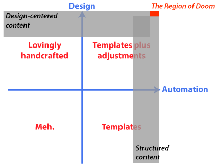
Instead, think of design and automation as different facets of your content. Each quadrant of the design-automation relationship results in different types of documents. High design and low automation is where you find coffee table books. High automation and low design encompasses invoices, bad WordPress sites, and 30 percent of the world’s data sheets. Low design/low automation is just crap–web sites hand-coded by people with no skills, anything written in Comic Sans, and the other 70 percent of data sheets. (Seriously, where did people get the idea that using InDesign without any sort of styles was appropriate for a collection of technical documents? But I digress…)
The interesting quadrant is the last one: high design and high automation. In this area, you find larger web sites, most fiction books, and, increasingly, marketing content (moving out of lovingly handcrafted as automation increases) and technical content (moving out of “ugly templates” and up the design scale).
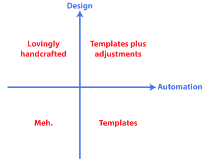
Design and automation and different facets of content creation.
The world of structured content inhabits a narrow slice on the extreme right.
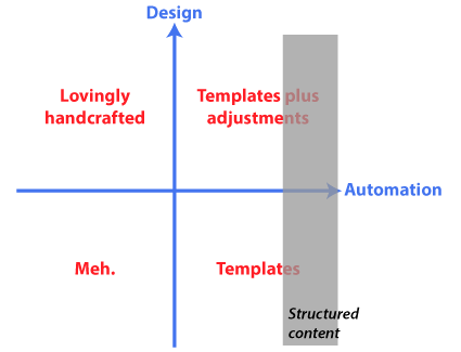
Structured content goes with high automation.
Design gets a similar swath of the top.
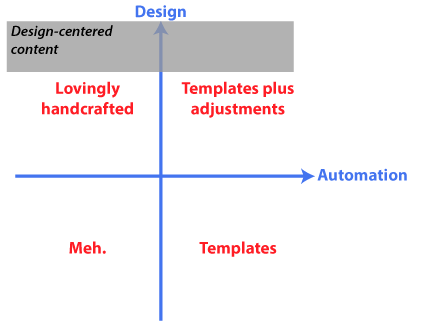
Design-centered content at the top of the design region.
When you combine a requirement for high design with a requirement for high automation, you get The Region of Doom.
You can accommodate 90% design and 100% automation or 90% automation and 100% design, but if you are unwilling to compromise on either axis, expect to spend a lot of money.
A better strategy is to focus on the 90% area. By eliminating 5–10% of the most challenging design requirements, or by allowing for a small amount of post-processing after automated production, you can get an excellent result at a much lower cost that what the Region of Doom requires.
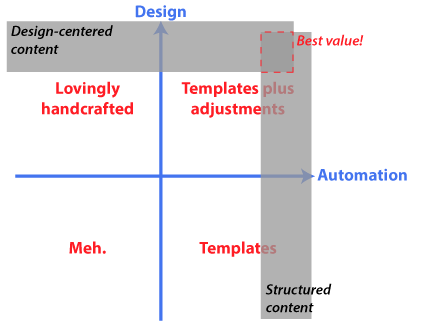
Small compromises in design and/or automation result in big cost savings.
Exposition
When we discuss design versus automation, we are really arguing about when to implement a particular design. An automated workflow requires a designer to plan the look and feel of the document and provide templates for the documents. The publishing process is then a matter of applying the predefined design to new content.
The traditional design process ingests content and then people apply design elements to it manually.
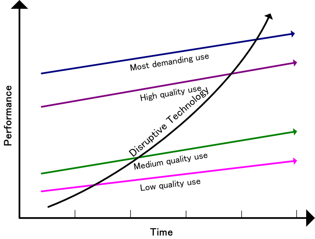
In other words, automation requires design first, and this approach disrupts the traditional approach to design. Like any disruptive innovation, this new approach is inferior at first to the “old way” (hand-crafting design). As the technology improves, it takes over more and more use cases.
Travis Gertz writes an impassioned defense of editorial design in Design Machines: How to survive the digital apocalypse:
Editorial designers know that the secret isn’t content first or content last… it’s content and design at the same time.
[…] When we design with content the way we should, design augments the message of the content.
[…] None of these concepts would exist if designed by a content-first or content-last approach. It’s not enough. This level of conceptual interpretation requires a deep understanding of and connection to the content. A level we best achieve when we work with our editors and content creators as we design. This requirement doesn’t just apply to text. Notice how every single photo and illustration intertwines with the writing. There are no unmodified stock photos and no generic shots that could be casually slipped into other stories. Every element has a purpose and a place. A destiny in the piece it sits inside of.
He provides wonderful examples of visuals entwined with content, mostly from magazine covers. And here is the problem:
- As Gertz acknowledges earlier in the article, for many small businesses, basic templates and easy web publishing are a step up from what they are otherwise able to do. Their choice is between a hand-coded, ugly web page (or no web presence at all), and a somewhat generic design via SquareSpace or a somewhat customized WordPress site. Magazine-level design is not an option. In other words, automation gives small business the option of moving out of the dreaded Meh quadrant.
- What is the pinnacle of good design? Is it a design in which graphics and text form a seamless whole that is better than the individual components? Many designers forget that not everyone can handle all the components. A fun audio overlay is lost on a person who is hard of hearing. Without proper alternate text, a complex infographic or chart is not usable by someone who relies on a screen reader.
- The vast majority of content does not need or deserve the high-design treatment.
- An advantage of visual monoculture is that readers know what to expect and where.
- All of these examples are for relatively low volumes of content. I don’t think these approaches scale.
Coda
What do you think? Scriptorium builds systems that automate as much as possible, and then use additional resources as necessary for the final fit and finish. Only some limited subset of content is worth this investment. I know that I have a bias toward efficient content production so that companies can focus on better information across more languages.
For more on this topic, come see my session at Big Design Dallas in mid-September.




Yves Barbion
Great post again, Sarah! Thanks.
I agree: design and automation go hand in hand. I call these techniques “designing for automation”, analogous to “writing for translation”. Strictly speaking, content should be separated from presentation, but this does not mean that the writers can write the (structured) content in any way they can think of and then let the stylesheet developer (or translator) figure it out. And finding the right balance between design and automation is sometimes a challenge, because you don’t always know in advance how the content will be published in the future.
Sarah O'Keefe
Hi Yves,
Travis Gertz (the linked post) makes the slightly different argument that visual design needs to be intertwined with the content for maximum effectiveness. I think that only a very small subset of content is worth this investment. For the rest, “designing for automation” is a great phrase.